One of the roles that i’ve developed for myself over the past few years working for the Tulane University Marching Band is helping to develop and strengthen its brand. This has mainly been external, as in creating and attempting to unify all of our social media presence, helping guide the feel of our new website as well as the content. I’ve made some small efforts in creating internal branding (some office vocabulary, unification of internal manual styles, &c), but those have been lower priority. And of course there’s aspects of the brand that i don’t create but the organization creates itself, such as “the band does crazy dances to our drum cadences during mardi gras”, something that bore fruit for the first time this past mardi gras season as people along the route saw us, recognized us for that, and actually anticipated it.
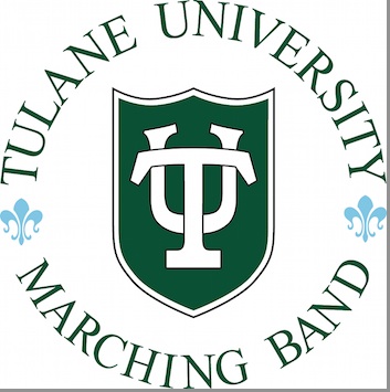
A couple of years ago, there was some discussion about potentially changing our TUMB logo, which right now is this:
There were a couple of different reasons for this. One was that a circular logo is very awkward to put into print because it takes up a lot of visual space if you want the “Tulane University Marching Band” text to be visible in a small form. Second was that the main logo portion, the graphic shield with the TU in it, is the Tulane University shield and therefore their brand. As a result, glancing at the logo has a TU association with it but not necessarily a TUMB association with it.
The issue was explored but then eventually dropped as low priority. Even though i think it’s somewhat problematic, it’s actually not too terrible because the shield logo is featured prominently on our uniforms and sousaphone covers without the accompanying circular TUMB text:
This is becoming relevant again because we’re in initial talks of trying to design and roll out a new uniform in a couple of years when the new Tulane Community Stadium gets built, and in that talk, we’re putting serious consideration into replacing the shield with a different logo or symbol or removing a logo from the front of the uniform altogether. Given that that shield will no longer have prominence, i rebroached the subject of potentially changing our logo, an argument that we want to either have something distinct from the TU shield as our brand so there’s no potential brand recognition confusion, or (as a compromise to my boss who does not want to change the logo at all) to modify or characterize the shield in a subtle way that makes it more TUMB specific so that the association from the university isn’t lost, but it can still feel like our own.
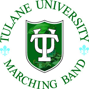
To experiment with the latter, i messed with creating TUMB image overlays to fill up the green area of the shield to see what it would look like:
If you can’t tell, right now there are three image overlays – one of a baritone player and his horn, three snare drums and some sticks, and some color guard flags. The idea is that the entire green shield portion of the logo would have overlays of some sort.
I’m not convinced that it’s working, but it could be that i just need to choose my images differently or instead opt for one single large image (such as a trumpet overlay). There’s still a potential problem that if the logo is too small, the character within the green shield would look “dirty” and look more like a mistake rather than something deliberate and purposeful which would weaken rather than strengthen our brand, and it still doesn’t address the issue of the circular text.
So i’m putting questions out there for those who have more informed opinions than me about the subject:
1. Is the logo fine the way it is?
2. Whether it stays the same or changes, how important is it for a sub-organization of a brand, particularly a marching band who is strongly tied to the university community, to have a distinct logo to create brand independence?
3. If it’s important enough to warrant a change, would it be better to a) create a logo that is a modification of the shield to retain strong relation to the primary University brand, b) create a logo that uses some other distinct representative symbol associated with the university (such as the Gumby or Riptide), or c) create a logo independent of all of those things?


The Stanford Marching Band has its own logo independent of the university, and even its own mascot. The University ends up using the Band’s mascot for advertising/promotions/etc.
I think it’s good for bands to be as independent as possible.