
So I had some time today to work on some much-needed updating around marketing for nF. This year in particular I wanted to have some physical merch and gifts in the form of t-shirts/polo shirts and stickers that use nF’s primary brand.
This was supposed to be relatively simple – I did a search for some New Orleans companies for custom shirts and stickers (I’m making an effort to support local businesses) and found a handful. I decided to start with shirts and explored prices and options for Faux Pas, a company I already had some familiarity with as we used them in the past when I was still working for Tulane Bands. I went to their website and used their mockup to place the nF logo on a blank polo to see what it would look like, and there I discovered a problem.
Recently I’ve shifted my overall brand philosophy to have “short” vs “long” versions of my various brands, and my short brands are designed to be enclosed by circles for almost all social media standards. I’ve come to appreciate the overall simplicity of short logos over long ones and prefer to use them in all sorts of marketing except when i want full banners.

I shifted my own personal “Mendel Lee” brand to its current logo years after I created the one for nF. For my own logo, I decided that the circle aspect of the logo needed further emphasizing which manifested itself as a simple thin white circle.
Granted, on some of my sub brands (Mendel Drums, Mendel Plays), I don’t have a border like this, but there’s reasons for that that are tangential to this post.
The wisdom of creating that real border was made even more clear because of my attempts to put the current nF logo with no real border on a shirt using Faux Pas’s online tools.
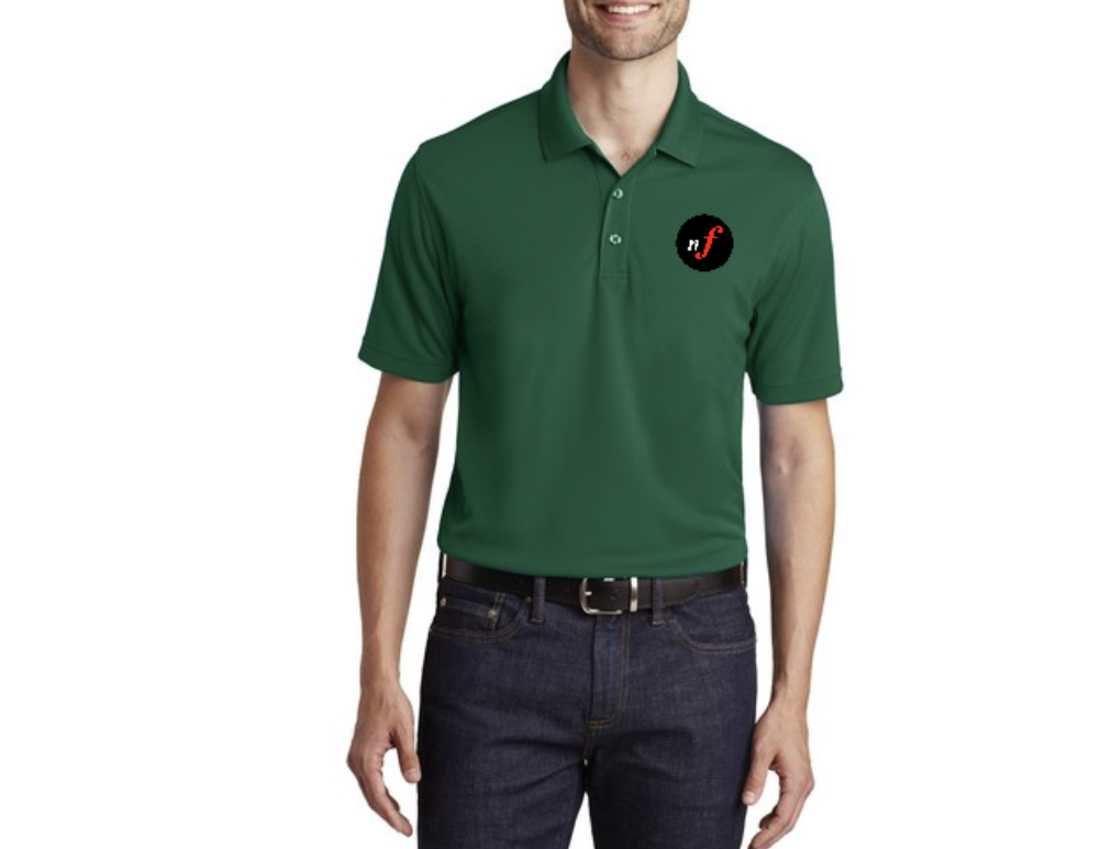
Basically, the black part of the logo is supposed to be considered background, and on social media and in print materials it can easily be seen as such, but on a shirt that is itself a background color, the black looks like it’s a part of the brand. No other logo’ed shirt in my memory imprints a background on top of the background of the shirt. It comes off as amateur. The alternative of eliminating the black and having it be just the nF with nothing else looks too bare.
The simple solution is to create a circle that borders the logo and have the background be transparent, similar to how my “M” brand is, but there’s a part of me that is now leaning towards creating something that is circular in shape but stylized, not dissimilar to how tapspace‘s logo, the published of my timpani solo, is stylized. A part of me balks at the idea of the complexity that that will introduce in what I feel is a simple and clean logo – especially because that then creates more complications around how that circular shape is then used in conjunction with the long banner logo – but a stronger part of me feels like it’s a good step towards further elevating the brand, something that has been slowly happening over time.
The addition of that complexity then raises an important question: what color should that shape be?
The true color scheme of the nF logo both in its short and long-form is complicated. The part that is of highest importance is the red F. The color of the “n” (and the “niente -orte” in the long logo) has been white or black as, again, a neutral part of the brand to make the red F stick out more. This is something I leaned on in particular when I was making seasonal print booklets and used that “red capital at a later point in the text” as a centralized theme.
I knew that using a pure red was a bold choice for the branding – red is rarely used for logos for both practical and philosophical reasons, but I deliberately went against the conventional wisdom because I really wanted the F to be a true exclamation point for the brand. That’s also why I wanted the everything else to be a neutral color, to make that exclamation point really stand out, and to not overwhelm the whole brand with all red.
So this creates a clear predicament around adding other design elements to the brand. If I create a stylized circular shape that is red, it could dilute the red of the F in ways that I don’t want – it could even make the white or black “n” in the short logo stand out more. On the flip side, a color associated with a stylized circular shape makes that a part of the brand, so making that black or white shifts it out of the neutral space in a way less amateur but still not too dissimilar to putting the logo on a shirt with a printed black background color.
So where does this leave me?
Two choices:
1: Stylize the circular shape but in a way that is not dominant. Something thin and emphasized towards the right could work, and then the remainder of the logo can still be black or white. If I do it the right way, I might even be able to make it work with the long logo too, although that would be challenging.
2: Introduce for the first time ever a second “true” color to the brand. Something that can act as a more neutral element that still makes the red F stand out, and one that can withstand either a dark or light background.
All of this, in addition to having to redesign the logo from scratch in Affinity Designer since I don’t have access to Adobe CC anymore *and* I don’t have access to the original font I used for the red F anymore because I no longer use Sibelius – has turned this whole “it should be easy to print shirts and stickers” into something much more complicated. We’ll see how it all plays out, but I think that what it could end up doing is making me scrap the t-shirt/polo shirt for now and instead just do a limited number of stickers – I can do a redesign of the logo and everything with it as more marketing/publicity for nF’s landmark 15th anniversary. I may even hire or consult with a graphic designer to help me fine-tune my ideas like I’m some sort of real company or something.
We’ll see.