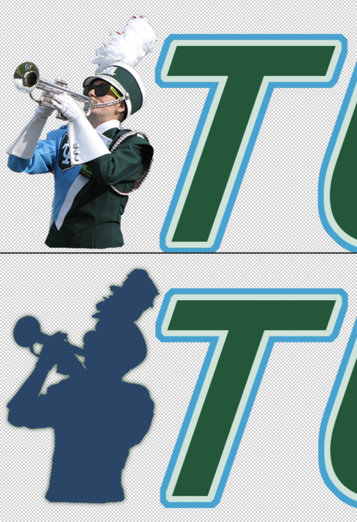
As Tulane Bands has recently officially unveiled its rebranding, I thought it would be worth documenting and writing about the history of the brand and its logos throughout the program’s recent history from my perspective as the primary brand force.
The Original Logo
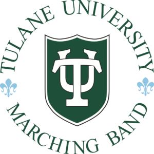
The very first Tulane University Marching Band logo was developed prior to my hiring in 2008. This functioned pretty well within the brand philosophy of Tulane University and our association with it at the time – the TU shield is very strong and is also prominently displayed on the front of our marching band uniform. The fleur-de-lis that separated the top and bottom half of the words established New Orleans as its flavor.
That said, even when I was first hired I felt like the logo didn’t stand out as a TUMB brand. I also didn’t like that the full text was in a circular logo that did not scale well – as a social media thumbnail, the text on say, a mobile phone, could be so small that you had to strain if you wanted to read it, and the TU shield was so dominant that it made our thumbnail virtually indistinguishable from the broader Tulane University thumbnail.
So after a couple of years in the program, I started asking myself, “How would I change this?”
The 2013(ish) brand shift
While changing the brand was in my head early on, it wasn’t until the 2012-2013 school year that I started to actually experiment and open up Creative Cloud with a fresh vision for the brand. As I started development, a few conceptual components coalesced as its foundation.
1. Stylizing the TUMB
The TUMB acronym was well-established both internally and with the community, so I wanted that to dominate the brand presence more than the fully spelled out “Tulane University Marching Band”. I also wanted to move away from using a circular shape for the full brand logo – while circular was good for social media thumbnails, it wasn’t great for banners or headers. I imagined that the visual icon/element that I was building into this could eventually stand on its own once it was well enough established with the brand text.
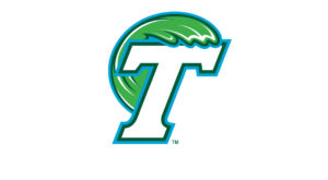
When conceptualizing how I would style the text, I wanted to establish a stronger link to Tulane Athletics. At the time, their primary brand revolved around a stylized slanted T, something that we had incorporated into our pregame drill sets – we made a “straight T” that linked to the Tulane University T and then moved to the “slanted T” that mimicked the Athletics T as the end of our performance of the Tulane Fight Song.

So I decided to use that slanted T as the basis for the TUMB text design. While there were certain aspects of that slanted T that were a direct mimic – the slant angle, the double-color border – I made a few deliberate differences to make it feel like an homage rather than a straight copy:
- Although the official TU logo and the Athletics T used serifs, I decided to go non-serif. This was because the TUMB’s pregame drill set lacked serifs for ease of readability based on the number of members we had at the time, so I wanted our text to reflect that. I also felt that the serif was too formal for the overall image of the TUMB I was trying to project.
- Color choices. The Tulane Green was considered by my boss to be an important part of our brand identity, so I decided to lean in on that and make the fill of the text green. The border of light/Newcomb blue and off white were a part of Tulane’s official brand colors at the time (while pure white was not), which I thought worked well – the muted white accentuated the Tulane green better than pure white.
(As an aside, a very subtle thing I did with the final version was shift the “UMB” two pixels to the left from the default spacing from the T, necessitating creating two separate text blocks for the “T” and the “UMB”. I felt like the default spacing made the negative space between the T and the U too far apart in comparison to the space between the other letters.)
2. The Visual Image/Images(?)
The other primary conceptual element revolved around answering the question, “How do I create an image/symbol that people can immediately associate with the TUMB?”
A single color silhouette of a marching band member in uniform was one of the first things that popped into my head, but unlike what ended up happening, my original concept was not to associate the brand with the trumpet player as the sole silhouette. Instead, I wanted a more advanced concept of brand identity – to allow the silhouette itself to be flexible and changeable every one or two years, unifying it as the TUMB brand more by having it always include four elements:
- The official Tulane dark blue as the silhouette color
- The silhouette always being clearly a TUMB member playing an instrument, dancing with poms, or spinning a flag
- Always having the TU shield be present in the silhouette
- Always have the silhouette be placed in the same spot relative to the TUMB text

I pitched this to the staff at the time, taking prominent action shots of various TUMB instrumentalists and turning them into silhouettes – a trumpet player, a bass drummer, a flute player, a color guard member. My boss in particular was highly resistant to the introduction of this new brand in the first place and was even more unconvinced about the silhouette being ‘flexible’, so in an effort to compromise and to try to push the brand forward at all, I said, “let’s table that piece of it – for the time being, we can use the trumpet figure and we can revisit whether we use other images to replace it in a couple of years.” Eventually, my boss reluctantly agreed to move forward and so the new brand was established and launched. In the first two years of its implementation, I tried a few times to revisit the idea of swapping out the silhouette for a different one over time, but I eventually gave that up when it became clear that I wasn’t going to win that fight.
Despite losing that part of the battle and despite the shift being a little shaky to start and more gradual than I would have liked, the new brand eventually became an invested part of the TUMB identity for the staff, its members, and its community, and a strong and dominant brand force that I had intended it to be from the very beginning.
Naturally, once it reached that point, I was already thinking about a change.
Rebranding for the TUMB Centennial
Sometime in 2018/19, I was itching to redo the brand logo that I had created, and decided that using the band’s centennial in 2020/21 would be a good vehicle for that change.
Part of the desire for the rebranding came from external factors:
- Tulane Athletics shifted their brand away from the slanted-T to its current Riptide logo.
- Brands at the more professional level were shifting to be softer, particularly when it came to text fonts and styles.
- Tulane University reinvented its brand philosophy to include more modern color schemes and nuanced brand concepts, particularly around the TU shield and what they called the “TU shield abstractions“, a flexible use of the TU shield outline that could be customized for varying purposes. I gained access to those assets, as well as Tulane’s official fonts (whereas the font i used for the old TUMB logo’s text was something that was bundled with Adobe PS/Illustrator’s default font set, a font I chose because I felt it was the closest mimic of the Tulane Athletics T in style).
- The Tulane Bands staff wanted to shift away from considering the “TUMB” as the overarching brand for the entirety of our organization. since the brand didn’t quite fit as the parent for the Concert Band, Soundwave, or other parts of us that weren’t exactly “marching band” related.
However, more of my desire to change the brand was motivated by my heightened understanding of brand even outside of these external factors. While I’ve always had an instinct for branding concepts, my execution particularly when it comes to logos has been mostly self-taught, and there were things about the visual logo part of the brand that the less-experienced-me from 2012/13 created that the more-experienced me realized were glaring errors.
Some of those errors were easy and subtle to fix – the green glow around the silhouette was at times eliminated entirely, particularly for certain printing processes, use of monochrome versions of the brand, or embroidery that couldn’t translate that glow in a meaningful way. The TU shield was used incorrectly according to Tulane’s brand guidelines (because I put it on a slant and distorted it to mimic how it would be viewed on an actual uniform), so we took that out of some of our designs.
But what became clearest to me over those years was that the trumpet figure itself was both philosophically and practically too complicated.
When i created the original silhouette, I simply took the original trumpet photo, trimmed it to encompass the player only, then applied a solid fill overlay.
Practically, the plume in particular with all of its detail was hard to replicate in embroidery situations or when the resolution of the end result was limited. I was already bothered by the fact that we had some versions of the icon that had the glow vs didn’t, had the shield vs didn’t, but the complexity of the physical shape not translating to certain printing situations meant that even the physical look of the icon had variants which always rubbed me the wrong way even if it was only barely perceptible to the human eye.
Introspection about this and more direct observations of brands both successful and unsuccessful over a period of many years led me to better articulate the philosophical understanding of why the brand I created was not as strong as it could have been:
Brand logos are symbols, icons, and successful ones are clean in their symbolism. No successful brand icon is photorealistic.
While the 2012/13 TUMB brand was done pretty much completely on my own, the office dynamic had since shifted to be more collaborative in general, so the staff came together to talk about the new branding in meetings and email exchanges. When we all sat down to initially discuss my rebranding ideas in conjunction with theirs, I advocated strongly that we eliminate the trumpet figure and start completely from scratch. I wanted to create something more abstract that could encapsulate our program, leverage clearer shapes and lines that could be synergized with the Tulane color palette. This was met with strong resistance – my boss in particular had grown to love the icon and associated it very closely with the TUMB brand (which in one sense was incredibly gratifying), and Andrew, the other Assistant Director was leaning in that direction as well.
After a few back and forths about it, I decided to try to find a middle ground. “If we’re going to keep the trumpet figure,” I said, “let me at least try to clean it up and fix what’s broken about it.”
So I fired up Illustrator and did just that.
Phase 1: Everything but the plume
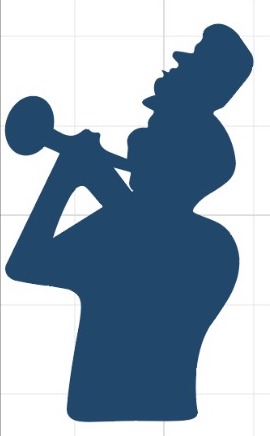
The first iteration of this was to ignore the plume issue because I wasn’t sure how to tackle it yet and simply take the bumps and creases around the bottom half of the body and in the negative space between the two arms and smooth them out whilst keeping the same overall shape. I also opted to simplify the trumpet and take out the valve pipe detail.
While that last decision was subject to debate, even smoothing out the bottom half got positive response from the rest of the staff who now had a clearer idea of what I was trying to accomplish. From there, I went full speed ahead and started fine-tuning the curves, balancing the left and right sides, and a myriad of other micro-changes to how all of those vector curves were built while simultaneously exploring bigger picture modifications with the plume detail. This turned into a series of back and forth stages where I would mock up three or four different revisions of the current design, send them to the rest of the staff (which now included our newly hired Program Coordinator) for feedback, discuss the changes, and then mock up new versions based on the feedback.
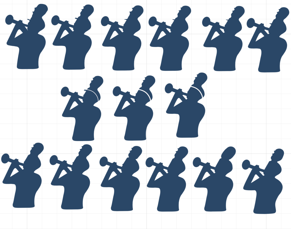
The process ended up being incredibly fun and engaging as a group playground/project, one of the more enjoyable full-staff collaborations I’ve had with this job. I played around with a few different elements:
- protruding hat brim – in the original image, the brim of the hat was present as a three-dimensional protrusion. I wanted to switch the approach of the image to be more like a symbolic straight profile, so I modified the shape of the hat brim to reflect that. It went through several different iterations/shapes – between curves vs rectangles vs triangles. At one point, Andrew suggested taking the brim out altogether. When I tried that, i didn’t initially like it because I felt like the loss of that detail and separation between head and hat was important.
- trace hat brim – one way that I tried to compensate for this was to create a break in the head and hat with a trace line. I had originally thought about this as being white before changing my mind to conceive of it as transparent. This was met with mixed reactions – including my own. I didn’t open up that rabbit hole necessarily because I felt like it was right, but I wanted to put it out there as something radical that could still help retain the separation I was looking for if we eliminated the brim entirely.
- nose – the other way I tried to compensate for the elimination of the brim was to add a nose protrusion. The protrusion was meant to be subtle, a true ‘edge of nose’ that was not overly noticeable unless you focused on it, but would clearly be missed if it wasn’t there.
As the drafts and processes moved forward, however, I became more and more convinced by Andrew’s suggestion that having a straight line with no nose/brim was simpler and cleaner and that the detail didn’t confuse or muddy up the clarity of what was actually happening. In the end, the straight line with no brim, nose, or trace hat brim ended up being the consensus for all of the staff, a conclusion that I didn’t expect when I first started, but I was ultimately very happy with.
Phase 2: The Plume
At the same time, I was tackling the plume, and I decided to approach it similarly – take out most or all of the detail to make it cleaner. I went as far as making it into a clean oval with no feather detail. While all of us eventually came around to the straight line for the face, that same pure cleanliness for the plume faced stronger and more persistent disagreement. While reducing and simplifying the plume detail was fine, eliminating them entirely eliminated the one organic and unique character that the other staff didn’t want to abandon. While I didn’t completely agree with this, enough of the direction of the image was going my way and my feeling about this was not so strong that I consented. I played around with where that feather detail was located on the plume, sometimes influenced by earlier stages of the brim/nose, before arriving at its final location and overall shape.
The final piece that we discussed and drafted centered around how much division there was between the head/hat and the plume itself. In the original, the head/brim/plume all bled into each other particularly as a three-dimensional profile, and with the new cleaner look and with the loss of the brim, my boss made a suggestion to sharpen and indent a curve that more clearly separated the hat and the plume. I drafted a few versions of this separation, some very extreme, which I liked, but Andrew really didn’t like. In the end, I landed in the middle, giving the curve some definition and separation, but not so much as to make it completely independent from the top of the hat.
Finalizing the brand logo with other brand elements
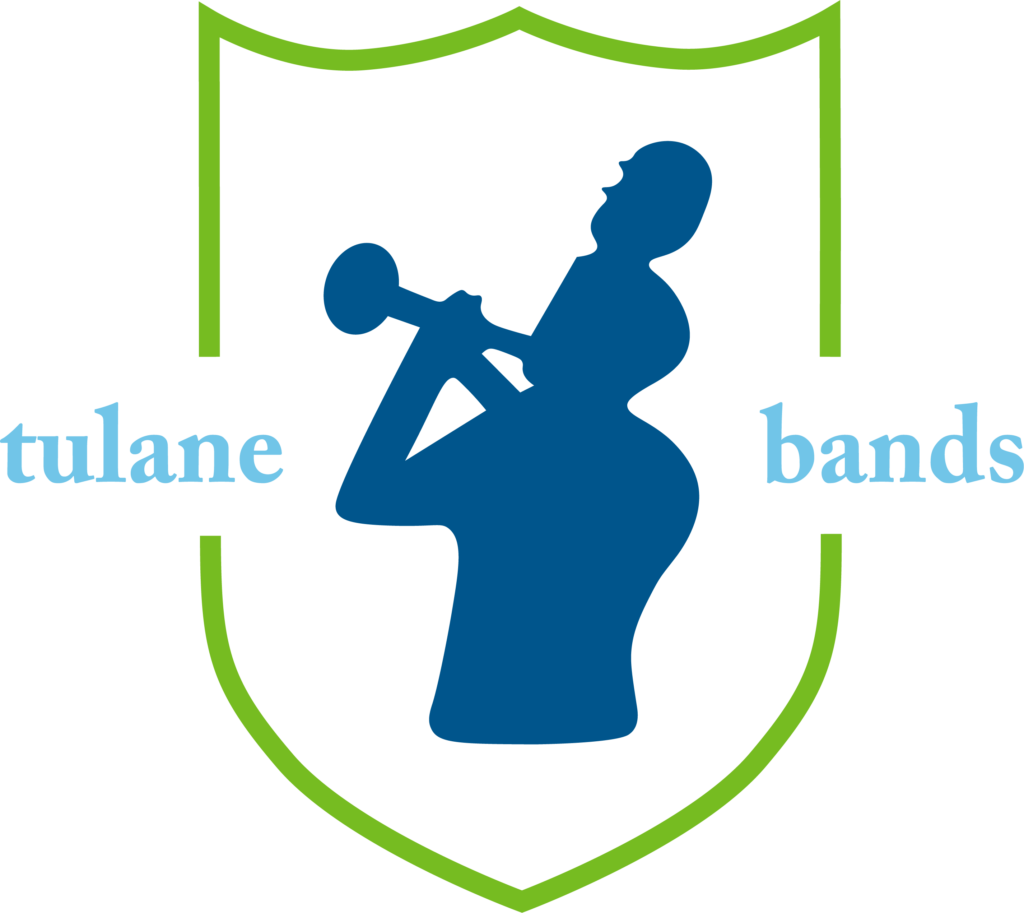
The final brand took that trumpet figure and wrapped it around the Tulane shield abstract and stylized text – a design that was lifted directly from our custom “100th anniversary” logo we developed the previous year. I knew that I wanted to include Tulane’s new shield abstraction assets as a part of the design, and it was also a no brainer to use “Tulane Bands” as the text to fully embrace the change in our program’s conception to make the “TUMB” an entity within the parent organization of Tulane Bands.

Accompanying this was an alternative “header” that could be used to label sub-ensembles or emphasize certain highlights in print or online. We had talked about unifying this header to be the primary driving force for all of our sub-ensembles, but we eventually steered away from that concept because we wanted some of the sub ensembles to be able to retain their own sense of identity despite being a part of the arching Tulane Bands umbrella, not unlike, for example, Kellogg’s cereal. The Kellogg’s K is printed somewhere on all of their cereal boxes, but the sub-brands of the cereals themselves are all unique and don’t necessarily have direct ties to the K’s brand design. In this new context, Tulane Bands is the Kellogg’s where Soundwave, the Green Wave Brass Band, Shockwave, KKY, the Color Guard, and now the TUMB is the Frosted Flakes/Frosted Mini-Wheats/Cracklin’ Oat Bran/Honey Smacks. They all deserve their own independence under the Tulane Bands primary brand.
Final Thoughts
There’s still work to be done with the branding – I want to redo the Green Wave Brass Band logo from its current design as it suffers from some lack-of-cleanliness issues that plagued the original trumpet figure (since I designed it around the same time). I also am starting to think more about how we approach the potential reintroduction of a TUMB logo – something that doesn’t feel right at the moment because I think that would hinder the pace and understanding of our rebrand since the trumpet figure migrated from the TUMB brand to the Tulane Bands brand.
That said, I’m pretty proud of the work that I’ve done to create and harness the brand of this organization – not just this change, but even the older brand change and the band’s conception of our brand identity over the years. I’ve made my mistakes, and I still have a lot to learn, but I also trust in my intuition and my introspection when it comes to brand establishment at this sort of scale, something that I’ve tried to do not just with my job with Tulane Bands but also with nienteForte and myself. I have no doubt that over time as brand concepts and my comprehension of them continue to evolve, I’ll want to shake things up and reinvent my branding somewhere again, although I imagine that it will come not from my work with the Tulane Bands brand over some of my other projects in the immediate future. My own personal brand logo hasn’t changed now in almost a decade and a half and while a part of me is still in love with it, another part of me is ready to take a step back and blow it all up.
This article was lightly edited after initial posting.

